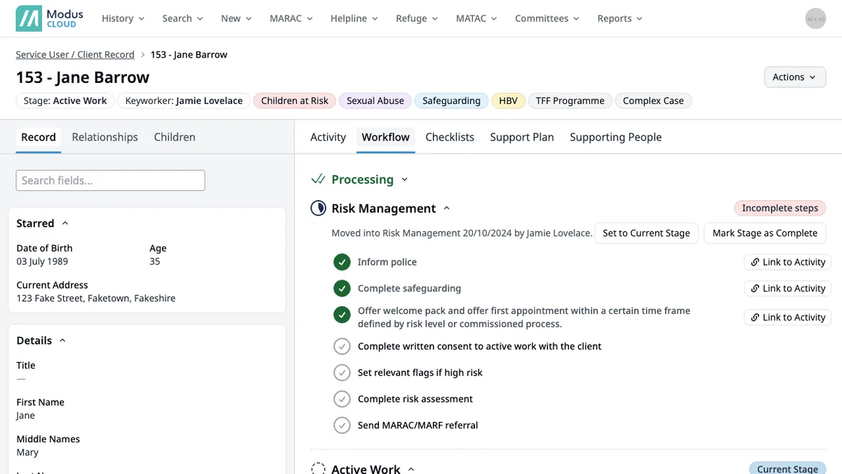
Akero

Product Design, Front-end Development, UX Research
CRM & Advertising platform aimed at the education sector. Akero is a large CRM system which includes a form builder, landing page builder, automation and an advertising platform.
akero singular contact dashboard view

What is it

Akero is a suite of tools aimed primarily at Universities and higher education to drive their recruitment process. It includes; a form builder, landing page builder, marketing automation, CRM, advertising management, reporting along with much more.

My role

I was hired as the lead designer and take hold of the front-end as it was currently being done as a side to the backend.

Whilst working on new features I tidied up previous CSS as I went, so refactoring as I go, it seemed to make the task less daunting, but eventually a redesign and rebuild did happen, due to an abundance of new features and slight change in product direction.

The product

About 6 months into my role the idea of what Akero was had already started to drastically change, it was previously used for capturing form submissions through Facebook pages. The old design worked just fine for this, but there was going to be a plethora of new features coming so the decision was made to give the platform a redesign.

The previous design was very design-heavy, so my first thought was to clean it up by reducing the colour palette and removing a lot of the visual noise. I also reduced the reliance on icons, a lot of the previous icons had no meaning, making it hard to distinguish what each icon was relating too.

Singular contact view displaying information
Singular Contact View
Landing page builder UI in Akero
Landing Page Builder

As far as the front-end was concerned, this needed a lot of work, the HTML and CSS was very messy and not very maintanable, I started creating small CSS components along with semantic HTML, making it easier for developers to start adopting a simpler approach.

Implementing the redesign was a difficult process due to having to maintain the current version along with adding new features too. This meant having to combine the two seperate versions so they didnt diverge. Actual git merge hell, due to the markup completely changing in most instances.

Feature Submissions

table of submissions in Akero
Submissions Table
The most used part of the system is the submissions table, so after studying how some users use this table we ran some prototypes of the new table types. Each user had their own use cases for each column in the table, so removing columns was not an option, we opted for a side-scrolling table with sticky table headers along with options to customise which columns you’d see.

Giving the users the freedom to choose how they see their data increased user satisfaction and we were being sent feedback on how easy the table is to use.

Feature Page Builder

Landing page builder with drag and drop interface
Landing Page Builder

Clients needed a way of building landing pages that their ad's run to. Usually, they'd have to either pay per landing page or get a developer to build them. With the landing page builder, clients could quickly put together a landing page along with a form to capture their data.

After researching how current users would like to build pages, an approach of using semi templated blocks was used. These could be an image and text, a banner, etc. This allowed the user to be able to quickly build out pages whilst keeping the design consistent throughout the page.

After some feedback and research, clients wanted a few more customisable features so these templated blocks became almost a layout after I added in variable content, where the user could add a text area, form, button, image, divider, or even custom HTML.

Feature Advertising Management

Media plan view displaying information
Media Plan

Akero was slowly evolving into a full advertising management platform. This was all done in house by the parent agency, but the process was slow, cumbersome, and messy; involving advertising assets and amendments going back and forth on emails, all whilst being updated on Net Suite. So we began to build out a platform that allows clients and the agency to have a more streamlined experience.

This involved creating a brief form for clients to fill out and then generate a plan based on platform preferences, their target audience, and the type of advertising they are using. Once this is all approved the agency user can start building a media plan, where they'll choose the platform, ad types, and dates the ads are running.

They can view their plan in the table view or a schedule view so managers and clients can review the media plan easily.

Gantt chart table displaying the schedule
Schedule table

Next stage is platform assets, in which the clients can see exactly what their images will look like on the platforms their ads are running on. The agency can then view these and give suggestions on how their ads could perform better.

What I've learnt

This is by far my biggest challenge to date, it involved a lot of UI architecture and made me think about the variety of users and their different needs.

My biggest take away is you can never know how a user is going to use something until its used. Always a suprise!

What would I do differently

I'd have loved to get more real user data before implementing some components/features but it often wasn't feasible, due to time on both our side and the users. Getting features that aren't quite ready shipped fast seems quite odd sometimes as it might not be the best solution, but thankfully these things can be iterated on over and over.

Another thing I would've done is include accessibility controls right from the offset, it's often looked over but important and easy to implement. Luckily because of the move over to Vue, it has meant I can build the new components with accessibility in mind.